author: niplav, created: 2019-04-10, modified: 2020-07-20, language: english, status: on hold, importance: 3, confidence: possible
A while ago, I became interested in personal estimations of life expectancy. I wanted to know how accurate people are at estimating their own life expectancy (by checking actuarial tables and whether accuracy correlates with age or gender). I went out and collected data, which is shared and analysed here.
Actuarial tables are of great interest to statisticians, gerontologists and policymakers. In this piece, data about subjective life expectancy of urban germans is presented, analyzed using linear regression and compared to actuarial tables. Gender and age differences in accuracy of assessing ones own life expectancy are also considered.
This text uses the terms "subjective life expectancy" and "estimated life expectancy" interchangeably.
~500 random people were approached (the exact number of approaches was regrettably not recorded) during the day in the streets of the center of a major german city. They were asked the following questions (in the presented order):
If the respondent was unsure after the second question, they were told: "Nur eine grobe Schätzung" to indicate that they weren't expected to make a perfect estimate. If at any point the respondent seemed uncomfortable, the interrogation was stopped with step 4 directly.
If after the first question the respondent didn't seem able to understand, they were asked the following questions (in that order):
Similarly, if the respondent seemed unsure after step 2, they were told to only give "a rough estimate" of the number.
The perceived gender of the respondent was then noted together with their age and estimated age.
Data was collected in the time from February 2019 to August 2019.
The raw data is available in CSV here.
Code to load the data from the CSV file:
    .l("csv")
    .l("nstat")
    .fc(.ic("./data/estimated_life_expectancy.csv"));data::csv.load()
    m::1:$'{1_x}'flr({"m"~*x};data)
    f::1:$'{1_x}'flr({"f"~*x};data)
    data::1:$'{1_x}'1_data
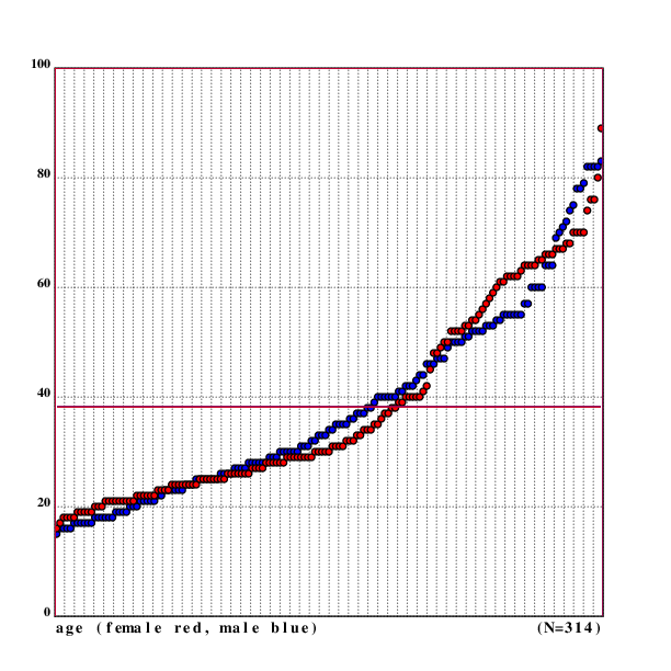
Of the 250 respondents, 125 were male and 125 were female. The mean age was 38.228 years (37.192 years for men and 39.264 years for women), with the youngest respondents being 15 years old and the oldest being 89 years old (youngest/oldest male: 15/82, youngest/oldest female: 16/89). The standard deviation for age was 17.5 (17.17 for men, 17.76 for women).
    dm::mu(*+data)
38.228
    fm::mu(*+f)
39.264
    mm::mu(*+m)
37.192
    ages::(*+data)@<*+data
    mages::(*+m)@<*+m
    fages::(*+f)@<*+f
    *ages
15
    *|ages
89
    *mages
15
    *|mages
82
    *fages
16
    *|fages
89
    sd(ages)
17.4981146412977875
    sd(mages)
17.1700651134467163
    sd(fages)
17.7597945934067604
Code for the image:
.l("nplot")
.l("./load.kg")

cgrid("age (female red, male blue)                      (N=",($#data),")";[0 100 20])

setdot(3)
fillrgb(0;0;1)
scplot(mages)
fillrgb(1;0;0)
scplot(fages)

setrgb(0;0;0)
segplot(100:^dm)
setrgb(0;0;1)
segplot(100:^mm)
setrgb(1;0;0)
segplot(100:^fm)

draw()

As one can see in the image, the ages of the respondents by gender follow a very similar pattern, except a lack of women aged 40 to 50 and a lack of women older than 75. Perhaps a bias on my side? But I remember to have noticed that older women are less likely to answer, especially questions about age.
Estimates of life expectancy were interesting: The mean estimate was 83.248 years, 82.016 years for men and 84.48 years for women. The lowest estimate of life expectancy was only 30 years, the highest was 200 years (lowest/highest for males: 30/120, lowest/highest for females: 39/200).
On average, respondents estimated that they had 45.02 years left in their life, women estimating having 45.216 left in their lifes, men with 44.824 years. The lowest estimate for years of life left was 1, the highest was 169 (lowest/highest for males: 1/86, lowest/highest for females: 1/169).
The standard deviation for the estimated age was 14.32 (13.29 for men, 15.18 for women).
    estages::(*|+data)@<*|+data
    mu(estages)
83.248
    mestages::(*|+m)@<*|+m
    festages::(*|+f)@<*|+f
    mu(mestages)
82.016
    mu(festages)
84.48
    *estages
30
    *|estages
200
    *mestages
30
    *|mestages
120
    *festages
39
    *|festages
200
    :"yl: years left"
    yl::{(*|x)-*x}'data
    yl::yl@<yl
    muyl::mu(yl)
45.02
    fyl::{(*|x)-*x}'f
    fyl::fyl@<fyl
    mufyl::mu(fyl)
45.216
    myl::{(*|x)-*x}'m
    myl::myl@<myl
    mumyl::mu(myl)
44.824
    *yl
1
    *|yl
169
    *myl
1
    *|myl
86
    *fyl
1
    *|fyl
169
    sd(estages)
14.3246115479617805
    sd(mestages)
13.2941996374358693
    sd(festages)
15.1860989065658333
Code for the image:
.l("nplot")
.l("./load.kg")

cgrid("estimated age (female red, male blue)           (N=",($#data),")";[0 200 20])

setdot(3)
fillrgb(0;0;1)
scplot(mestages)
fillrgb(1;0;0)
scplot(festages)

setrgb(0;0;0)
segplot(100:^dem)
setrgb(0;0;1)
segplot(100:^mem)
setrgb(1;0;0)
segplot(100:^fem)

setwidth(1)
setrgb(0;0;0)

draw()
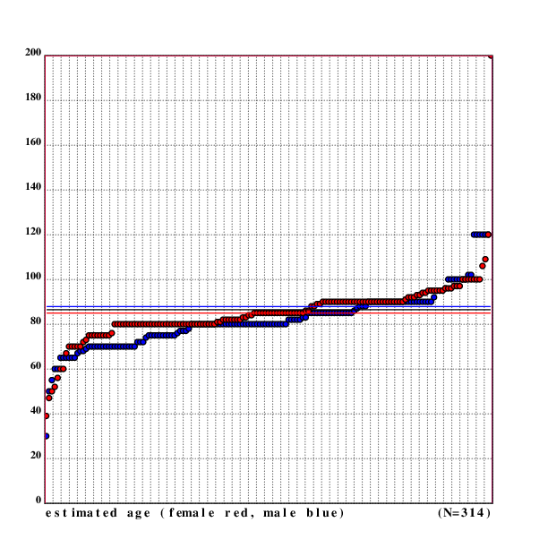
The black line between the blue line for the male average estimated age and the red line for female average estimated age is for the overall average estimated age.
One can now do a linear regression on the data and try to find out what the relation between estimated age and real age is.
    lreg(data)
[0.143075581058418136 77.7785066872987915]
    lreg(f)
[0.110387262427545795 80.1457545280448419]
    lreg(m)
[0.17043090258300147 75.6773338711330093]
The regression shows a positive relation between age and subjective life expectancy, which is stronger for men than for women.
One can now also calculate the correlation between age and estimated age, which is 0.1431 for the whole data set, 0.1104 for women and 0.1704 for men, indicating that men become more optimistic when growing older.
    cor@+data
0.14307558105841815
    cor@+f
0.110387262427545804
    cor@+m
0.170430902583001477
This can be shown in a scatter plot of the data.
.l("nplot")
.l("./load.kg")

grid([0 100 20];[0 220 20])
fillrgb(0;0;1)
setdot(3)
scplot2(m)
fillrgb(1;0;0)
scplot2(f)
xtitle("age")
ytitle("estimated age")

setrgb(0;0;1)
plot(lr(;lreg(m)))
setrgb(1;0;0)
plot(lr(;lreg(f)))
setrgb(0;0;0)
plot(lr(;lreg(data)))

draw()
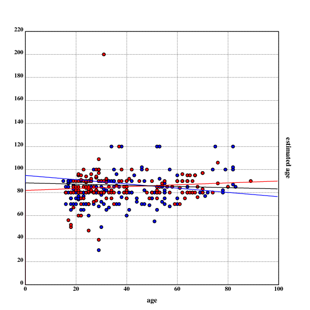
The red dots represent data points from women, the blue ones are from men. The red line is the linear regression for the data by women, the black line is the linear regression for the whole data, and the blue line is the linear regression for the data by men. Outliers are clearly visible, and the difference between the linear regressions is also visible.
One can also compare the data collected to existing actuarial tables, and determine if there is a systematic deviation between subjective life expectancy and the values given by actuarial tables.
For this, one can calculate averages for a given age, both separately for genders and for the whole data set:
    grf::=*+f
    abaf::mu'(*|+f)@grf
    :"female averages, by age"
    rf::(*'(*+f)@grf),'abaf
    grm::=*+m
    abam::mu'(*|+m)@grm
    "male averages, by age"
    rm::(*'(*+m)@grm),'abam
    gr::=*+data
    aba::mu'(*|+data)@gr
    "averages, by age"
    r::(*'(*+data)@gr),'aba
Next, one needs actual actuarial tables for information to compare the collected data to. Because the data was collected in Germany, the actuarial tables were taken from the Federal Statistical Office of Germany. The actuarial tables were downloaded, converted from ISO/IEC 8859 to UTF-8 and arranged in the following form:
age,life expectancy m,life expectancy f
The resulting data can be viewed here.
Now, one can start comparing the collected estimates to the actuarial tables. To do this, one first loads the data into Klong:
    known::{(1:$*x),(1.0:$x@1),(1.0:$x@2)}'1_known
    mk::{x@[0 1]}'known
    fk::{x@[0 2]}'known
    kr::{(*x),((x@1)+x@2)%2}'known
The variable kr contains the mean of the female and male actuarial values.
Since one has already calculate the average estimates for life
expectancy by age (the variables grm, grf and gr), one can now
compute correlations between the estimates and the actuarial tables. The
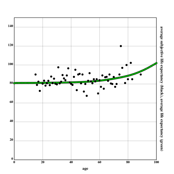
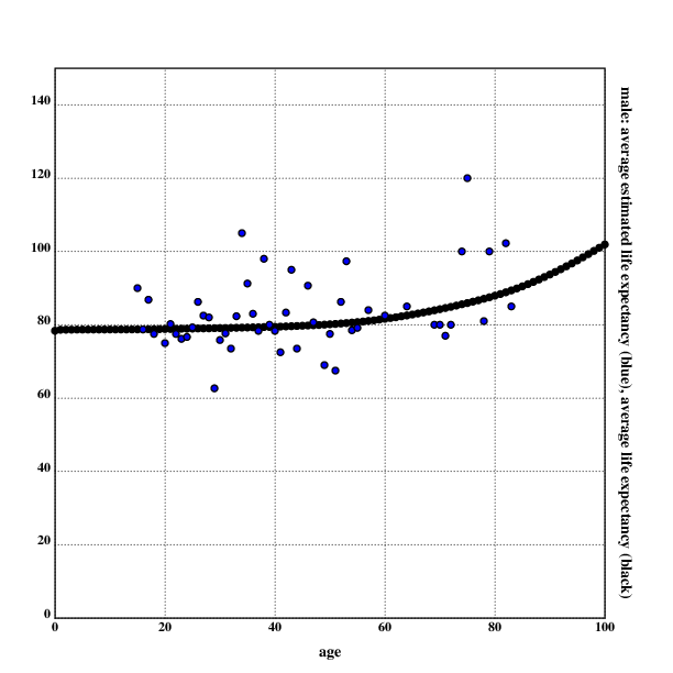
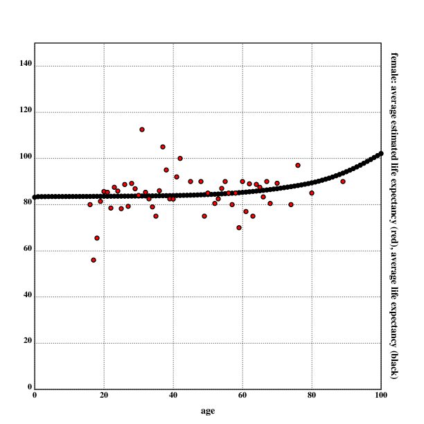
correlation between the estimates and the actuarial values is 0.0957,
0.0772 for men and 0.0348 for women.
    cord::cor(aba;*|+kr@*'(*+data)@gr)
0.0957337523144531185
    corm::cor(abam;*|+mk@*'(*+m)@grm)
0.0772309898403104608
    corf::cor(abaf;*|+fk@*'(*+f)@grf)
0.0347646631118574528
One can now also visualize the estimates and actuarial values.
For the mean estimate:
.l("nplot")
.l("nstat")
.l("./load.kg")

grid([0 100 20];[0 150 20])

setdot(3)

fillrgb(0;0;0)
scplot2(mk)

fillrgb(0;0;1)
scplot2(rm)

xtitle("age")
ytitle("male: average estimated life expectancy (blue), average life expectancy (black)")

draw()
For men:
.l("nplot")
.l("nstat")
.l("./load.kg")

grid([0 100 20];[0 150 20])

setdot(3)

fillrgb(0;0;0)
scplot2(mk)

fillrgb(0;0;1)
scplot2(rm)

xtitle("age")
ytitle("male: average estimated life expectancy (blue), average life expectancy (black)")

draw()
For women:
.l("nplot")
.l("nstat")
.l("./load.kg")

grid([0 100 20];[0 150 20])

setdot(3)

fillrgb(0;0;0)
scplot2(fk)

fillrgb(1;0;0)
scplot2(rf)

xtitle("age")
ytitle("female: average estimated life expectancy (red), average life expectancy (black)")

draw()
As with most self-reported data, there are numerous problems with this approach. The data presented here represents estimates often made in a very short amount of time, and is prone to misunderstandings.
It seemed like very often people misunderstood that the estimate they were asked for was not asking for the age they hoped for, but the age they estimated. It would not have been practical explaining this to people, since the response rate already was quite low and there were sometimes severe difficulties in understanding, but this seems to be the strongest bias in the data. Interestingly, a surprising number of people seemed to hope to die earlier than the average person, especially a woman aged 29 who hoped to die at 39.
Keeping in line with the lizardman constant, there was a number of joke answers and sometimes even straight lies. Most of the people who answered that they estimated to become 120 years old fit into this category (the woman who estimated that she would become 200 years old seemed convinced of that, though). There was also a number of people who either looked way too old or lied about their age.
The visualisation of the data shows a clear lack of women aged between 40-50 in the data set, as well as a lack of people older than 70. One possible explanation for this observation is an age-related bias by the interrogator. Another possible explanation could be that people older than 70 don't like to answer questions in the street, don't go outside very often, are rare, or lie about their age regularly. I note that it seemed to me that older women were most reluctant to answer my questions, but that may just be another manifestation of personal bias.
As with any street poll, this interrogation got responses from people willing to answer questions from strangers on the street. This could select for high openness, which could function as a proxy for optimism. Also, all people were interrogated in a big city, which could have biased the data (I am not sure which direction this bias woul tend). One could also argue that self-reported data is notoriously unreliable, but since the point of this data collection was to aggregate subjective estimates, this should not be an issue here.
The gender of the respondent was determined by a subjective estimate by the interrogator, which can lead to some problems in regard to incorrect perception by the interrogator (for example misgendering trans people). If there had been uncertainty about the gender, the respondent would have been asked about their identified gender. This was not done on all respondents, since it would have increased the response time and therefore decreased the amount of usable responses.
One can do a quick statistical estimate of the probability of encountering and misgendering a trans person. According to Flores et al. 2016, 0.6% of the U.S. adult population identifies as transgender. It is assumed that the numbers for Germany are similar. It is also assumed that the probability for a trans person passing is around 90% (I am just making this number up).
One can then use the binomial distribution to estimate the probability of misgendering at least one trans person. The code is in Klong. The probability of misgendering at least one trans person is calculated by calculating the probability of encountering n≤maxt trans people, multiplied with the probability of not correctly gendering all of them.
    .l("nstat")
    :"probability of being trans"
    pt::0.006
    :"probability of passing"
    pp::0.9
    "number of people asked"
    n::250
    :"maxt is the number so that the probability that I met"
    :"more than maxt trans people is less than 1 in a billion."
    maxt::{(1-b.cdf(x;n;pt))>10e-9}{x+1}:~1
    :"probability of encountering at least 1 trans person"
    1-b.pmf(0;n;pt)
0.777875686117172762
    :"probability of encountering at least 1 trans person and misgendering them"
    +/{(1-pp^x)*b.pmf(x;n;pt)}'1+!maxt
0.139330765507831189
The result shows that the probability of encountering and misgendering at least one trans person (and therefore at least one incorrect data point) is ~13%.
While answers were tracked, I did not think of writing down the number and gender of the people approached. It would have been interesting to see whether there are any gender-specific differences in answering rates, and it generally have been a better practice to write them down (also to determine the overall answering rate).